Twitter Bootstrap is an open source front end framework for HTML, CSS and JS, using which we can create a responsive UI for our web application. This is supported by all major browsers.
The design patterns included in Twitter Bootstrap are listed below:
Scaffolding
- Grid system
- Fixed-width layout
- Fluid-width layout
Typography
- Headings
- Body text
- Lists
- Inline labels
Misc Components
- Media thumbnails
- Tables
- Forms
- Buttons
Navigantion
- Fixed top bar
- Tab navigation
- Pill navigation
- Breadcrumb navigation
- Pagination
Alerts
- Basic alert messages
- Block messages
Dialogs
- Modals
- Popovers
- Tooltips
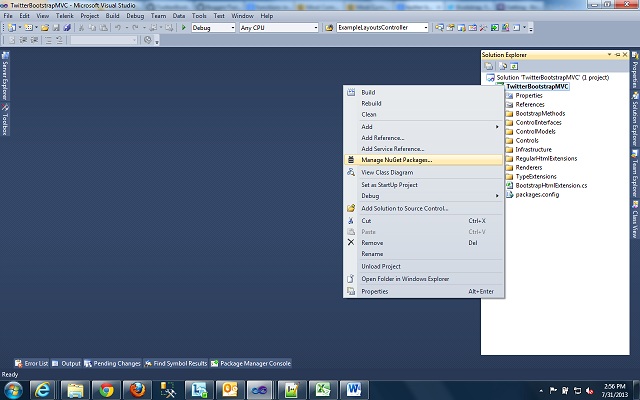
We can add Bootstrap into our Web application through ‘Manage Nuget Packages’. In Visual studio, source explorer, right click on your web project, click on the option ‘Manage Nuget packages’.

In the Manage Nuget Packages dialog, search for ‘Bootstrap’

Install Bootstrap 2.3.2 version. The following files are added to your project :
bootstrap.css, bootstrap.min.css, bootstrap-responsive.css, bootstrap-responsive.min.css,
bootstrap.js, bootstrap.min.js
This ensures that you are all set to use Bootstrap.
Bootstrap Usage:
Grid System – Bootstrap offers 2 types of Grids. The default grid system is Fixed grid which is 940pixels wide with 12 columns. We can add responsive stylesheet to it, and it’ll become adaptive to 724px and 1170px wide w.r.t the viewport it’s rendered on. And we have fluid grid system, this is not pixel based, instead it’s based on percentage and can be extended to the responsiveness same as fixed grid.
I’ve added bootstrap into my MVC application as I shown above. I’m adding fixed grid layout into Index view. The content will look like :

The css class ‘row’ is used for creating horizontal rows, and css class ‘span’ (value of ‘number’ can be 1 to 12) is used for creating vertical columns. We will end up creating 3 column grid using ‘span4’ class for each column. The ‘container’ class hold entire structure. We can also nest columns/rows. The view html results into following UI output:

Fluid-grid layout: The below html content shows the css classes to be used for Fluid grid layout

Notice that, different css classes(container-fluid,row-fluid) used for fluid grid layout. And it will result into,

Nav-bar – Using bootstrap we can creat a static navbar. This is explained here. We will take a view page, add nav bar into it.
We will create a Nav-bar with four menu items, a dropdown box and a search box. The css classes for each of them is from bootstrap.css/bootstrap-responsive.css. The HTML markup for the same is as follows-

Notice the css classes used for Navbar. And the Nav-bar looks like-

Bootstrap also allows us to create responsive variations of the navbar. We will see more about bootstrap usage in my next post.
